
Altru Gets Flexible: Responsive Designs in Webforms
Published
*Update: Responsive webforms will be released for Altru in a November release.
Altru webforms are not exactly practicing yoga, but they are becoming more flexible! We are excited to announce that this popular idea in our Altru community is part of our upcoming upgrade: mobile ready webforms. Along with the technical achievement of adding this feature to the forms, I am really impressed at how our engineering team has added this feature to the existing toolkit for designing web forms.
Before diving into the mechanics, I should slip in a quick mention that when we mention the term “mobile ready” we are actually referring to making the web forms “responsive.” The premise behind this feature is not just having design transition from the desktop into the palm of your hand - but to have the same design also adjust to the myriad screens that come in between (laptops, tablets and now even phablets). This way the web design is flexible and automatically adjusts to the size of the screen without requiring web user input. Now you can see what I meant by my reference to Yoga - which I know was a bit of a stretch! (Last pun I promise!)
In terms of implementing responsive design for web forms, the process is as simple as it can get. Kudos to the engineering team for adding a responsive design version for the existing templates available in Page Designer.
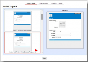
What I like about this feature is that you can keep your current approach (components based on the template selected) to designing web forms and adapt it to the responsive feature option by swapping out to the responsive version of the template. So let us have a look at an example of this design in action. The screenshot below is of a membership web form using the 2 column template in its widest format as we would view it on, say a desktop:
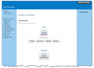
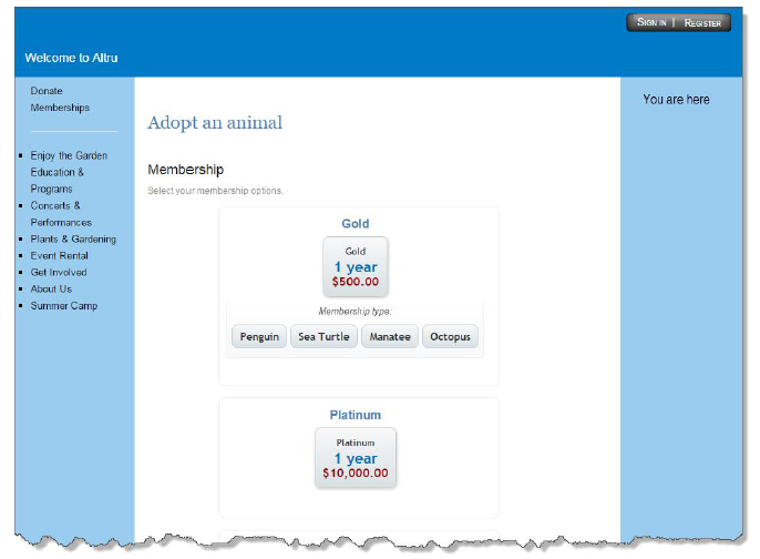
So, as you can see it looks pretty standard - not dissimilar to the standard two column template. However, the magic comes into play when we view this in on a smaller screen like a mobile phone. From the screenshot below, we can see how the template narrows down automatically to accommodate for the restricted width:

In the image above, we can also see that while the navigation columns have disappeared, they are replaced by an icon to represent the navigation. If one clicks on that icon, they are led to a display that represents the navigation.
Transferring to a Responsive Template
I am sure that many of you are quite excited and eager to transition your current design to the responsive version of your current template. However there are some things to consider and plan for before tripping the change.
Andrew Fort’s excellent blog post on the importance of preparing for a mobile platform also reinforces the importance of taking advantage of this new feature as it becomes available.
Please be sure to actively promote this update in your constituent communications. Apart from an announcement in your constituent communications as you launch this feature also remember to slip in a mention next to the web form link for your membership renewals or fundraising emails.
For an elegant example of how you can mesh your existing web site design with a responsive web form, just check out the membership form for Currier Museum of Art’s membership form. While currently the template is non-responsive, the design will transition very easily to the responsive version template. Please note you are not alone on this effort. If you need any assistance in adapting to responsive design please do not hesitate to reach out to your account executive (if you are already live with Altru) or consultant (if you are in the implementation or client success phase of your Altru project) and we will be glad to assist you with transitioning to a responsive design.
Altru webforms are not exactly practicing yoga, but they are becoming more flexible! We are excited to announce that this popular idea in our Altru community is part of our upcoming upgrade: mobile ready webforms. Along with the technical achievement of adding this feature to the forms, I am really impressed at how our engineering team has added this feature to the existing toolkit for designing web forms.
Before diving into the mechanics, I should slip in a quick mention that when we mention the term “mobile ready” we are actually referring to making the web forms “responsive.” The premise behind this feature is not just having design transition from the desktop into the palm of your hand - but to have the same design also adjust to the myriad screens that come in between (laptops, tablets and now even phablets). This way the web design is flexible and automatically adjusts to the size of the screen without requiring web user input. Now you can see what I meant by my reference to Yoga - which I know was a bit of a stretch! (Last pun I promise!)
In terms of implementing responsive design for web forms, the process is as simple as it can get. Kudos to the engineering team for adding a responsive design version for the existing templates available in Page Designer.

What I like about this feature is that you can keep your current approach (components based on the template selected) to designing web forms and adapt it to the responsive feature option by swapping out to the responsive version of the template. So let us have a look at an example of this design in action. The screenshot below is of a membership web form using the 2 column template in its widest format as we would view it on, say a desktop:
So, as you can see it looks pretty standard - not dissimilar to the standard two column template. However, the magic comes into play when we view this in on a smaller screen like a mobile phone. From the screenshot below, we can see how the template narrows down automatically to accommodate for the restricted width:
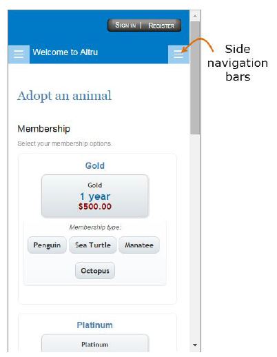
In the image above, we can also see that while the navigation columns have disappeared, they are replaced by an icon to represent the navigation. If one clicks on that icon, they are led to a display that represents the navigation.
Transferring to a Responsive Template
I am sure that many of you are quite excited and eager to transition your current design to the responsive version of your current template. However there are some things to consider and plan for before tripping the change.
- Please note that responsive templates are just a platform – they will not automatically convert your existing Web forms design components into an ideal mobile-ready design. For example, if you have a 980 pixel-wide header image, your template will not automatically adjust the size of that image. So, please review your existing design to make sure that it meets the parameters for a responsive format. While these designs can look simple, their code can be pretty sophisticated, so we encourage tapping resources that have knee-deep experience in responsive Web design to help adjust your current set up to conform to responsive parameters. If you don’t have someone on staff that fits the bill, our Blackbaud interactive team is not only experienced with web design, they’re also experienced with Altru, making them the perfect choice to do this work for you.
- Keep it even simpler! – While our mantra while designing Web forms is to keep it simple, when it comes to mobile ready Web forms, we recommend going even simpler. Remember users are on a small screen and they should be able to focus and complete their task efficiently.
- Be sure to check your design across different screen resolutions. All smartphone screens are not the same. Refer to online resources to identify popular screen resolutions. The chrome browser has a really neat Responsive Web Design Tester extension that will help you check the design on a desktop.
- Please remember that if your forms are live, design changes will be displayed to the public in real time. As it may not be possible to deactivate your Web forms, try and avoid working on the design when your online traffic to Web forms is likely to be busy (before a popular event or right after you send out a major appeal).
- Back up before and back up after. Please remember to keep backup copies of the HTML and CSS code of your original design before you start your transition to the responsive templates. This way you can quickly revert back to “square one” if needed. Making backup copies is really easy: For the CSS, just copy the code from the Advanced CSS window into a text file. For the HTML portion, open the HTML view of each section of the template copy the HTML code into its own text file.
- Please note that while the Web form templates are mobile ready, the acknowledgement emails have still the same functionality so please keep them simple so they are easily viewed on a smartphone screen. The basic rules are to keep the email design very simple (a single column display) the maximum image width less than 580 pixels.
Andrew Fort’s excellent blog post on the importance of preparing for a mobile platform also reinforces the importance of taking advantage of this new feature as it becomes available.
Please be sure to actively promote this update in your constituent communications. Apart from an announcement in your constituent communications as you launch this feature also remember to slip in a mention next to the web form link for your membership renewals or fundraising emails.
For an elegant example of how you can mesh your existing web site design with a responsive web form, just check out the membership form for Currier Museum of Art’s membership form. While currently the template is non-responsive, the design will transition very easily to the responsive version template. Please note you are not alone on this effort. If you need any assistance in adapting to responsive design please do not hesitate to reach out to your account executive (if you are already live with Altru) or consultant (if you are in the implementation or client success phase of your Altru project) and we will be glad to assist you with transitioning to a responsive design.
News
ARCHIVED | Blackbaud Altru® Tips and Tricks
09/21/2015 10:42am EDT
Leave a Comment
Interesting features, I think you need to work on the design, especially since I am a designer myself and use many design tools, for example, marble cute backgrounds where can you get interesting elements to update your interface