Fine Tuning the User Experience - Four New Features
Published
Now that you’ve seen the ResearchPoint New Features video, let’s take a look at some of the subtle but effective design improvements that simplify navigation. Here’s a quick look at four of them:
1. Search is such a big part of the system and is tremendously powerful. You can search Raiser’s Edge records (if integrated), ResearchPoint records, and if you are an Essentials or Professional customer, you can search the very powerful Target Analytics prospecting database. So with all this power in search, we made a simple improvement to allow the entire row of a search result to be clickable. Before you had to select ‘View RP’ and we noticed a lot of users fumbling around before discovering that… so now you can click anywhere and you’re good to go!
2. We added the “NEW” notification to the Wealth Summary view. If you have searched someone through WealthPoint previously and search them again to get updated information, you will get a “NEW” notification next to any section that contains new data. The “NEW” status goes away after you take action or navigate to that area.
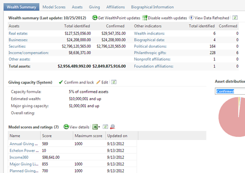
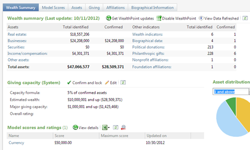
3. Wealth pages have been enhanced by making tabs more prevalent and changing the header font. This makes the page easier to navigate and also easier on the eyes:
Before:
After:
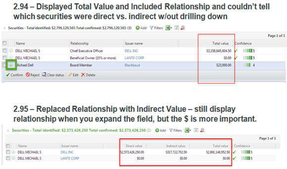
4. We’ve also decided to display at the first level (without drilling into each match) the Direct and Indirect Securities in separate columns. This is beneficial because the Total Confirmed Securities is just the Direct Securities totaled. As you can see from the screenshot below, in our current version (2.94) we have a column that contains $3 Billion but the Total Confirmed Securities is $2.7 Billion. If you didn’t drill into the match to find that some of that is Indirectly held and not calculated, that could raise questions.
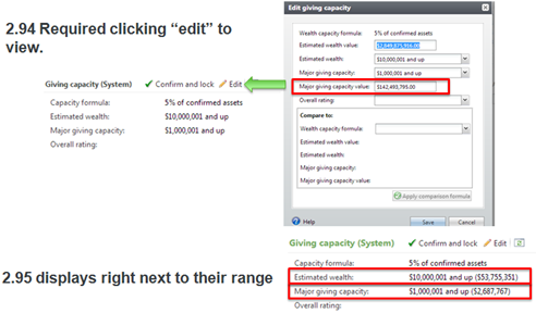
Along with this idea of not having to dig to find information you may need, we’ve brought back the Major Giving Capacity Value number to the Wealth Summary page. It now shows up in parenthesis next to the Major Giving Capacity Range.
With these improvements, you will spend less time navigating and clicking around the system. Stay tuned for a shortcuts post that provides you powerful favorite’s functionality. It builds off the theme of fine tuning your experience.
News
ARCHIVED | Blackbaud Target Analytics® Tips and Tricks
01/08/2013 11:19am EST


Leave a Comment