Infographics on Impact or Donation Pages
Over the weekend I thought soccer has given so much to me I thought I should start giving back and I set out to find a soccer charity to support and I found the US Soccer Foundationwhich converted me to a be a new monthly donor.
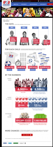
How did they do it? This inforgraphic below with a donation ask at the bottom.
Hey Community,
I wanted to tell you about a personal experience this week. I'm a big soccer fan, been playing since I was knee high and continue to play into my 30s because I just love the beauty of the sport, being out on the field, and how it helps counteract me sitting behind a computer screen for a good portion of the week. So over the weekend I thought soccer has given so much to me I thought I should start giving back and I set out to find a soccer charity to support and I found the US Soccer Foundation which converted me to a be a new monthly donor.
How did they do it? This inforgraphic below with a donation ask at the bottom.
Ok, it wasn't just the infographic because they personally checked off a few other criteria I had in my head however this graphic finished the job for me because they made what they do, the impact they have, what their plan is for the future and how my donation can help so clear and focused that I understood it in an minute and wanted to be a part of it.
They told their story quickly and effectively with a combination of compelling visuals and data and that appealed to me as a visitor. Visual storytelling has been a rising topic in the last few years especially with Pinterest, Facebook Timeline, Flipboard, USA Today, Scoop.it! etc. being in the news and posting impressive results - <shameless plug> we are even doing a webinar later this month on this very topic </shameless plug>. In researching for the webinar I learned about the statistical impact visuals can have on how easily we can process and retain information and I found it facinating how much it makes a difference.
One theory states that that is due to the Picture Superiority Effect :
- People will remember 10% of what you say to them three days later.
- If you communicate primarily with visuals (such as PowerPoint slides), your audience will remember 35% of what you show them.
- If you use both words and visuals, they will remember 65%.
I always knew I was a little more visually oriented but I was shocked by the difference and how it affects everyone. In my experience this weekend I was noticably less inclined/motivated to donate by other sites I visited during my research and I found the US Soccer Foundation's stats just stayed with me and evetually coverted me to being a donor.
Have any of you added infographics or impact visuals to your donation forms, donation options, what we do, or impact pages? Have you noticed a improvement in action rates from those pages?
Cheers


Leave a Comment