Web Optimization: Creating One Responsive Design For A Limitless Mobile World
Published
Website Mobilization
By Liz Hiers, Blackbaud Interactive Services Team
Did you know that organizations, on average, update their website every 2-4 years? While this seems to be quite frequent, and probably more often than some of you may like, if you think about your website in terms of technology, four years is a very long time!
Oh how far we have come:
Let’s think back to 2013— and the adoption of the smart phone, the start of smart watches, selfies and touch ID. Since then, the technology and surrounding market has continued to evolve. Today, Apple watches have added GPS and health tracking capabilities. Social media created the “selfie” and innovative accessories like the “selfie stick” for taking better pictures. And touch ID has evolved to allow for easy sign-on to apps and even as payment (i.e. Apple Pay).
And 2013 was the year of responsive design (Mashable). As a result, website experiences had to significantly change. From the way you design and develop a website to the Content Management System (CMS) you choose, to your search engine optimization (SEO) strategies. And once you’ve brought them to your site, they expect the best experience and one that must meet their mobile needs… on every device they own.
Prior to 2013, some organizations invested in a mobile version of their site in addition to their desktop version. However, many never made that investment and it wasn’t until 2015, that responsive website design emerged as a best practice in design.
What is responsive web design?
According to Wikipedia, or Nielsen Norman Group, an Evidence-Based User Experience Research Firm, responsive web design is an approach to web design aimed at allowing desktop webpages to be viewed in response to the size of the screen or web browser one is viewing with. So essentially, it is one site that responds to the dimensions of the devices that the site visitor is using. The content and images shift and adapt based on the user’s device.
What happened in 2015?
That was the year Google unleashed “Mobilegeddon”, and made an update to their search algorithm to rank mobile-friendly websites higher. Thus, there was a huge focus and a rush for nonprofit organizations to adapt. With this change, if your website is not mobile- friendly, your organization is competing against sites that are and only a heavy lift in advertising will change that. And, we all know, for many nonprofits, funds are limited and long term advertising as a fix for your SEO strategy to justify. A mobile-friendly site is a great investment if you have limited long term advertising dollars for paid search.
Let’s Experience:
Although going mobile will help your organization in the search rankings, there are other reasons to move toward a responsive website design. What does your website experience look like on a desktop, tablet or mobile device? Go ahead and look, we’ll wait! What do you think? Do you like what you see? Did you enjoy perusing your own site on all devices?
A study that Blackbaud conducted, showed that on average, nonprofits see a 34% increase in their conversion rate when they have a responsive website and a responsive forms.
A website is easier to navigate with responsive website design. Easier navigation encourages visitors to explore your content and engage. And if you accept transactions on your website (i.e. tickets or donations) you’ll want to make sure it’s easy to check-out and on any device!
As Brooke Hansel, Blackbaud Strategic Design Manager, mentioned in a previous community post, the overall user experience is just as important as having a responsive design.
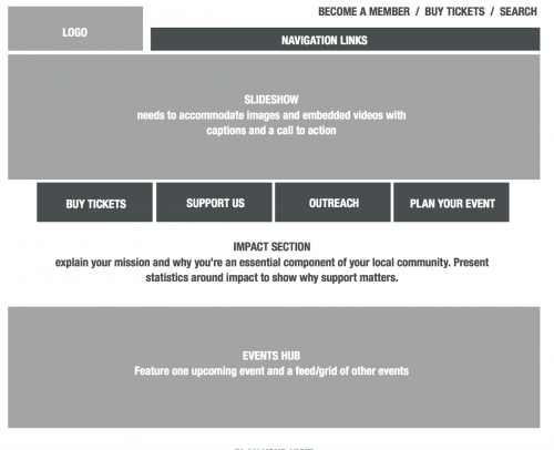
So, what is the answer? What are your site visitors expecting today? In the world where everyone is looking for access to information quickly, it is important that you create a site with a mobile-first experience in mind. Responsive, yes, but also one that has a strong focus on your content and the role of the content. Think about driving engagement and user experience for the mobile-user first, then expand up for the desktop users. Using a rapid prototyping, or a mobile-first and iterative process (illustration below) you are able really focus on your website experience, how to tell your story and engage your visitors on all devices. After all, that is the goal, right?

We love a good website. Check out part 2 of the Digi-Know Webinar Series to hear more from Brooke Hansel in the Blackbaud Interactive Services Team about Designing an Online Experience That Works. Register Today >
Does your website look good on every device? We have the dream team to make it happen! Learn more about Blackbaud's Interactive Services Team >
Have questions about optimizing your website? Are you a Blackbaud Champion? If so, head over to the Champions Hub and take our survey. Not a Champion? What are you waiting for! Sign Up Today >
By Liz Hiers, Blackbaud Interactive Services Team
Did you know that organizations, on average, update their website every 2-4 years? While this seems to be quite frequent, and probably more often than some of you may like, if you think about your website in terms of technology, four years is a very long time!
Oh how far we have come:
Let’s think back to 2013— and the adoption of the smart phone, the start of smart watches, selfies and touch ID. Since then, the technology and surrounding market has continued to evolve. Today, Apple watches have added GPS and health tracking capabilities. Social media created the “selfie” and innovative accessories like the “selfie stick” for taking better pictures. And touch ID has evolved to allow for easy sign-on to apps and even as payment (i.e. Apple Pay).
And 2013 was the year of responsive design (Mashable). As a result, website experiences had to significantly change. From the way you design and develop a website to the Content Management System (CMS) you choose, to your search engine optimization (SEO) strategies. And once you’ve brought them to your site, they expect the best experience and one that must meet their mobile needs… on every device they own.
Digi-know, Consumers ranked display (65%) as the most important aspect when it comes to
content experience in their personal life, and 54 percent listed overall good design, such as
appealing layout and photography as important.
Source: Adobe The State of Content: Rules of Engagement for 2016.
content experience in their personal life, and 54 percent listed overall good design, such as
appealing layout and photography as important.
Source: Adobe The State of Content: Rules of Engagement for 2016.
Prior to 2013, some organizations invested in a mobile version of their site in addition to their desktop version. However, many never made that investment and it wasn’t until 2015, that responsive website design emerged as a best practice in design.
What is responsive web design?
According to Wikipedia, or Nielsen Norman Group, an Evidence-Based User Experience Research Firm, responsive web design is an approach to web design aimed at allowing desktop webpages to be viewed in response to the size of the screen or web browser one is viewing with. So essentially, it is one site that responds to the dimensions of the devices that the site visitor is using. The content and images shift and adapt based on the user’s device.
What happened in 2015?
That was the year Google unleashed “Mobilegeddon”, and made an update to their search algorithm to rank mobile-friendly websites higher. Thus, there was a huge focus and a rush for nonprofit organizations to adapt. With this change, if your website is not mobile- friendly, your organization is competing against sites that are and only a heavy lift in advertising will change that. And, we all know, for many nonprofits, funds are limited and long term advertising as a fix for your SEO strategy to justify. A mobile-friendly site is a great investment if you have limited long term advertising dollars for paid search.
Let’s Experience:
Although going mobile will help your organization in the search rankings, there are other reasons to move toward a responsive website design. What does your website experience look like on a desktop, tablet or mobile device? Go ahead and look, we’ll wait! What do you think? Do you like what you see? Did you enjoy perusing your own site on all devices?
A study that Blackbaud conducted, showed that on average, nonprofits see a 34% increase in their conversion rate when they have a responsive website and a responsive forms.
Digi-know, on average, 83% of global consumers report they multiscreen, using 2.23 devices at the same time.
Source: Adobe The State of Content: Rules of Engagement for 2016.
Source: Adobe The State of Content: Rules of Engagement for 2016.
A website is easier to navigate with responsive website design. Easier navigation encourages visitors to explore your content and engage. And if you accept transactions on your website (i.e. tickets or donations) you’ll want to make sure it’s easy to check-out and on any device!
53% of mobile viewers will abandon a website if they have a poor mobile experience
SourDoubleClick by Google
SourDoubleClick by Google
As Brooke Hansel, Blackbaud Strategic Design Manager, mentioned in a previous community post, the overall user experience is just as important as having a responsive design.
So, what is the answer? What are your site visitors expecting today? In the world where everyone is looking for access to information quickly, it is important that you create a site with a mobile-first experience in mind. Responsive, yes, but also one that has a strong focus on your content and the role of the content. Think about driving engagement and user experience for the mobile-user first, then expand up for the desktop users. Using a rapid prototyping, or a mobile-first and iterative process (illustration below) you are able really focus on your website experience, how to tell your story and engage your visitors on all devices. After all, that is the goal, right?

We love a good website. Check out part 2 of the Digi-Know Webinar Series to hear more from Brooke Hansel in the Blackbaud Interactive Services Team about Designing an Online Experience That Works. Register Today >
Does your website look good on every device? We have the dream team to make it happen! Learn more about Blackbaud's Interactive Services Team >
Have questions about optimizing your website? Are you a Blackbaud Champion? If so, head over to the Champions Hub and take our survey. Not a Champion? What are you waiting for! Sign Up Today >
News
Blackbaud Altru® Blog
07/24/2017 10:30am EDT


Leave a Comment