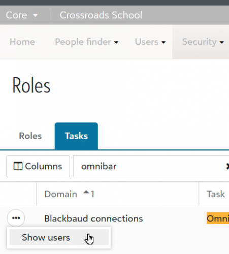
While the Omnibar was a welcome addition, it's annoying.
First, it takes away valuable vertical screen space.
Second, it moves “Faculty/Parent/Academics/etc./Core” selector all the way to the left, while most content is still centered on the page. It's also white on gray, which makes it less legible than the black on white.
Third, it needs to be consistent - either black and white everywhere, or green and black. Better yet, let us decide the color scheme.
Fourth, all pages take longer to load, since it has to figure out what permissions I have.
This is how the Omnibar should have been designed
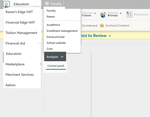 Suggested Omnibar Redesign