What's Next: A New Way To Get Around
Giving this blog post a bump (and slight updating), as the new navigation will soon roll out to everyone! To help ease navigation, you'll soon be able to — if not already! — search for constituents and manage multiple resources from where you also access feature areas within Raiser's Edge NXT. If you've already received the new navigation, here's a quick overview of what's what. Otherwise, here's a preview of what to expect, including new locations to search for constituents and access the database view!
 Jump between products. If you use multiple
 Jump between products. If you use multiple
 Blackbaud products that support Blackbaud ID, you can seamlessly switch between them and Raiser's Edge NXT.
Search for constituents. To find a constituent's record, select Search (the magnifying glass), and then choose a recently-accessed record or enter the criteria of who to find. For more information, see the Search for Constituents Help.
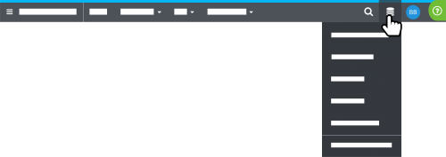 Open database view or another database. To access the settings and features of the database view, select Database (the database icon), Open database view. If you have multiple databases, you can also choose which one to use. For more information, check out the Database View Help.
Manage your personal settings. To manage your personal account details, select your initials.
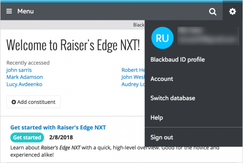 On mobile, much remains the same. For example, to navigate to different feature areas, select Menu. Or, as on your desktop, select the magnifying glass to search for constituents. However, under the new User menu (the gear), you can now find additional resources like your Blackbaud ID profile and account, additional databases, and the Help (previously available under a question mark icon).
Search for constituents. To find a constituent's record, select Search (the magnifying glass), and then choose a recently-accessed record or enter the criteria of who to find. For more information, see the Search for Constituents Help.
 Open database view or another database. To access the settings and features of the database view, select Database (the database icon), Open database view. If you have multiple databases, you can also choose which one to use. For more information, check out the Database View Help.
Manage your personal settings. To manage your personal account details, select your initials.
- To manage your Blackbaud ID and password used
 to sign in to Raiser's Edge NXT, select Blackbaud ID profile.
 - To manage your Blackbaud account and subscriptions, select Account.
- To securely sign out of Raiser's Edge NXT, select Sign out.
 On mobile, much remains the same. For example, to navigate to different feature areas, select Menu. Or, as on your desktop, select the magnifying glass to search for constituents. However, under the new User menu (the gear), you can now find additional resources like your Blackbaud ID profile and account, additional databases, and the Help (previously available under a question mark icon).
14
Comments
-
Still waiting on UK Postcode (Zipcode to you) being a valid search - we spent years "training" our supporters to give us their postcode when they phone in. (Yes, I tried it before I posted this comment!)0
-
I'm not a fan of now having the extra step of having to click on the magnifying glass to enter the constituent's name. Instead of streamlining the process, it adds a step.0
-
I agree with Tracy. Unfortunately, it seems it added a step when searching for a constituent and will take some getting use to.0
-
Yeah, one extra step for each person I look up (the click and then move to the search space) not helpful in productivity....if there is a way to change that, would like the old "just start typing"....0
-
You've just introduced an extra step in the workflow of every NXT user. Have you done any usability testing on this new search bar?0
-
I agree with the other commenters about adding the extra click. Also, NXT as a whole seems to run slower now, slower to load a constituent, slower to respond when I try to search...0
-
Hey all, thank you for your feedback. I'm the Principal Designer for the User Experience team and I was the Lead Designer for the new navigation including the change to Search.
When redesigning the navigation we were addressing a few issues. First we needed to make sure we were meeting accessibility standards. Accessible designs is one of our core principles. Second we needed to meet mobile standards for touch target sizes. The last big driver was to address feedback/concerns about the vertical space that was being eaten up before people could see meaningful page content. This particular concern is what drove us to compact navigation and cut the vertical footprint of it in half.
All along as we designed this, we were cognizant of not making tasks less efficient for people. The Search bar should have the same basic interaction as before. With the old Search, you clicked in the field and started typing. With the new Search, you click on the icon and should be able to start typing. Your cursor should autofocus that field once you click on the Search icon. If that is not the experience you are having, please let us know so that we can investigate what is going on.
As far as performance concerns, I am going to reach out to the Engineering team to investigate what is going on there.
Thank you again for your feedback.0 -
I should also add that regardless of the number of clicks if it feels less efficient to search now than it did before, I'd like to understand that better so we can consider changes to the design.
Any thoughts are appreciated.0 -
One of the very first things I loved about switching to NXT was the search bar at the top.
"With the new Search, you click on the icon and should be able to start typing. Your cursor should autofocus that field once you click on the Search icon."
The thing is, it doesn't FEEL the same. It feels more cumbersome. Is that a fair assesment? No, but design takes perception into account as well as reality. It seems like the consensus here is to change it back to what feels best for us, the end users.0 -
Without a doubt, user perception is an important facet of design.
I'll be completely transparent here. My challenge is to balance the need to recapture the vertical space, thereby reducing the navigation bar to 50px tall while also making Search feel as good as it did before. Keep in mind that the navigation bar needs to work for a whole bunch of applications outside of RE NXT and also needs to work responsively.
Without getting into a lenghty discussion on all the trade-offs at play here, I'm toying with some adjustments that might make this feel better. For example, we can tighten up the animation for the input field sliding in when you click the icon and maybe put a max-width on the field so that your focus doesn't have to shift suddenly from when you click the search icon to the cursor showing up on the far left of the screen.0 -
The constituent search is no longer intuitive and it's confusing some of my colleagues. I think it's because so many of us are used to opening up a web browser and typing in a search box in the top left corner when we want to search for something on the internet. The magnifying glass on the right side of the screen doesn't seem like it's in the correct place. Would it make more sense to have it on the left side where my eyes are immediately drawn? I'm not sure, but I share the sentiments of others who have already commented.
On a side note, I really appreciate these updates and that we're given the chance to comment.0 -
Responding to Nick's request for thoughts/suggestions:
Currently the "Raiser's Edge NXT" is static - it doesn't link to anything. Why not make that link to the Home page (standard practice), and then remove the "Home" from the top bar, and put the Search field where Home is now?
Nick QuagliaraI should also add that regardless of the number of clicks if it feels less efficient to search now than it did before, I'd like to understand that better so we can consider changes to the design.
Any thoughts are appreciated.
My original post (before I saw everyone else had the same feedback): Hey all, we don't like that the magnifying glass is over to the right. top left was best. That's where all the action happens and it's where I start everytime. Please move the magnifying glass back over. Appreciate the upgrades otherwise. Thanks.0 -
I also would prefer the search button to be back over on the left side of the screen. This is both because it's more intuitive for it to be on the left (left side of the bar is for doing my actual work, right of the bar is for managing my account) and because it's more ergonomic: with the new setup I have to move my eyes and my mouse cursor all the way to the right, and then I have to immediately move my eyes all the way back to the left as I start typing in the search field.
Separately: When I'm working with NXT, I very frequently open links in a new tab or duplicate my current tab in order to access other records or other information while keeping the current record or list open. I had gotten used to continuing to work in my current tab while I waited for the duplicated or newly opened tab to fully load. Starting two or three updates ago, I noticed that these new or duplicated tabs will no longer load in the background -- now I have to switch to them before they start loading. I have not had this issue with any other website I use, so I'm fairly confident it's not a browser issue.
I very much appreciate the transparency about design decisions and the interest in user feedback that Blackbaud is showing here.0 -
I am no longer seeing the ? (help) option at the top of the screen. How do I get that back?0
-
Hey Cathy! Great question. I assume you're using Raiser's Edge NXT on your mobile device? On desktop, the Help appears under the green question mark (?) icon like before. On mobile, however, you can now select Help from the new User menu (the gear icon). I've updated the blog post above to include the new navigation on mobile. I hope that helps. Thanks!0
-
I thought NXT lets you search by alias for a company? It didn't work for me, and that would be a huge help. (And to be able to add an alias in NXT instead of going to db view) Also, it would be helpful in Actions when adding a Phone action for the drop down box to include the phone type. I may not remember the phone number I call, but I remember if its cell or office or home. Thanks for letting us provide feedback!0
-
I wanted to pop in here qucikly and say that we'll be considering some tweaks to address the concerns that have been raised here. Good discussion! Keep in mind that there may be some design constraints that are not necessarily apparent due to the fact that the nav bar is used on several products and Blackbaud sites. Regardless my aim is to make Search feel good again. Thanks everyone.0
-
Thanks for the heads up, Nick! That's good to know. Anne- As a heads up, you can now (as of about a month ago) add and manage a constituent's aliases directly in the web view. To do so, select 'Edit', 'Aliases' under 'Constituent summary' on the constituent's record. You should also be able to use aliases to find both individuals and organizations in the constituent search. To find an organization that's a relationship for another constituent (rather than a full constituent itself), select 'View all results' or 'Search relationship records' at the bottom of the initial Search results. As for tracking the type of phone called for an interaction, that's an interesting concept... I'd recommend adding it to the Idea Bank (ie the Ideas tab above) to help us gauge interest. I hope that helps. Thanks!0
-
not a fan of the new search. i liked having it at the ready for whenever I needed to search a record. now it takes an extra step and it takes the other buttons off as choices. was this change really necessary?0
-
Thanks, Nick, for the explanation. It's more of the location of the search button. I'm sure part of it is just retraining my eyes to look to the upper right rather than the upper left, but it is a little wierd to have to look to one place to click then a separate place to type. Either moving the magnifying glass left or the search bar right would help. Thanks for repsonding. It's helpful to know that the design team is listening.0
Categories
- All Categories
- 6 Blackbaud Community Help
- 211 bbcon®
- 1.4K Blackbaud Altru®
- 402 Blackbaud Award Management™ and Blackbaud Stewardship Management™
- 1.1K Blackbaud CRM™ and Blackbaud Internet Solutions™
- 15 donorCentrics®
- 360 Blackbaud eTapestry®
- 2.6K Blackbaud Financial Edge NXT®
- 656 Blackbaud Grantmaking™
- 577 Blackbaud Education Management Solutions for Higher Education
- 3.2K Blackbaud Education Management Solutions for K-12 Schools
- 941 Blackbaud Luminate Online® and Blackbaud TeamRaiser®
- 84 JustGiving® from Blackbaud®
- 6.7K Blackbaud Raiser's Edge NXT®
- 3.7K SKY Developer
- 248 ResearchPoint™
- 120 Blackbaud Tuition Management™
- 165 Organizational Best Practices
- 240 Member Lounge (Just for Fun)
- 34 Blackbaud Community Challenges
- 37 PowerUp Challenges
- 3 (Open) PowerUp Challenge: Grid View Batch
- 3 (Closed) PowerUp Challenge: Chat for Blackbaud AI
- 3 (Closed) PowerUp Challenge: Data Health
- 3 (Closed) Raiser's Edge NXT PowerUp Challenge: Product Update Briefing
- 3 (Closed) Raiser's Edge NXT PowerUp Challenge: Standard Reports+
- 3 (Closed) Raiser's Edge NXT PowerUp Challenge: Email Marketing
- 3 (Closed) Raiser's Edge NXT PowerUp Challenge: Gift Management
- 4 (Closed) Raiser's Edge NXT PowerUp Challenge: Event Management
- 3 (Closed) Raiser's Edge NXT PowerUp Challenge: Home Page
- 4 (Closed) Raiser's Edge NXT PowerUp Challenge: Standard Reports
- 4 (Closed) Raiser's Edge NXT PowerUp Challenge: Query
- 796 Community News
- 3K Jobs Board
- 54 Blackbaud SKY® Reporting Announcements
- 47 Blackbaud CRM Higher Ed Product Advisory Group (HE PAG)
- 19 Blackbaud CRM Product Advisory Group (BBCRM PAG)
