Resource Boards


I know there are older threads about this already, which I've definitely gathered ideas from, but wanted to check in to see if anyone has recently (in the last year or two) revamped their Resource Boards and if so, if you'd be willing to share a screenshot. We're interested in seeing how other schools:
- Organize the content
- What buttons do you have: are there broader divisional buttons that then hold all of the resources for that division? Or are there more specific buttons?
- What type of content are you putting on the Resource Board?
- Organize the actual buttons (alphabetical? most visited content?)
- Style of the buttons
- Do you use photos, icons?
- Same background color for every button? Or different? Is there rhyme or reason for the different color backgrounds or just random within your school's branding?
- Do you utilize the title/description, or do you just put a space there and incorporate the title into the button graphic?
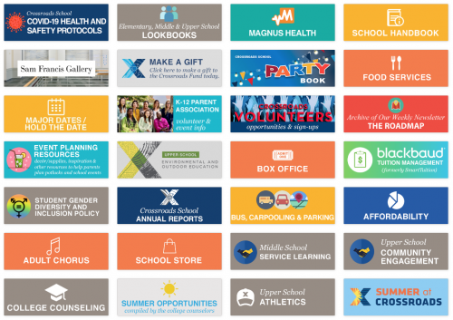
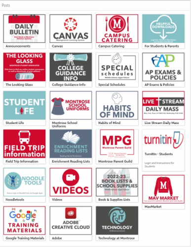
Attached is an example of what we currently have for an Upper School parent. I like to think it started off as more streamlined, but then over the years has gotten a bit out of control. ![]() Looking forward to hearing what has/hasn't worked for other schools! Thanks!
Looking forward to hearing what has/hasn't worked for other schools! Thanks!
Comments
-
@Ginette Buffone - I have nothing to do with the design of our resource boards. That's handled by another group at the school.
Our boards look much like yours. Upcoming events that have a tile (Parents' days, Back-to-school, etc) are positioned near the top of the board prior to the event. There does not seem to be a discernible pattern for the rest of the tiles.
We do not use the text fields on the tiles - the tile's purpose/title is part of the graphic on the tile. That means that it's not possible to search for a button by using the browser's Control-F find. I have to look at each tile until I find the one I'm looking for.
1 -
@Brian Gray Hi Brian, thanks for responding! We initially incorporated the title into the graphic to help keep the buttons uniform/grid, but I've realized I miss being able to use the Find feature in my browser. It would be so helpful!
In case anyone else is interested…we had also reached out to our peer schools, and one of them shared an example that I really like. It is uniform and clean, but also utilizes the titles and brief description, so you could use the Find feature. See below:
 1
1 -
@Ginette Buffone
Hi Ginette, We used to have a board that looked similar to @Brian Gray. When we got a new Communication Director, she wanted to change them all, and I lost that battle. I find it more difficult to find what I'm looking for now than when I represented each service with its own logo.It's always a real problem with order of buttons, especially since Communications will move buttons around, depending on importance at that time, like for fundraising campaigns, reenrollment, etc. Some buttons, like conferences, I put on when it's sign-up time and then expire them after conferences. I used to have them alphabetized, but they're not anymore.
Ours used to look like this (pardon my mark-up - this was a training slide):
Here's the re-design with part of the Upper School board, filtered on faculty role.
 1
1 -
@Ginette Buffone Here's ours. Our in house graphic designer created the images last summer - before that they were even more of a mishmash of images we had lifted from the internet. I like the idea of making them shorter from top to bottom, then we'd be able to see more of them at once.
This one is for students:
This one is for Faculty
 1
1 -
@Kim Ashcraft
I would love to see how your boards are “set up” when you click on each of these tiles. We're just getting started, and I want to be consistent and organized. Thank you!0 -
@Suzanne Senackerib I agree! I love the look of the uniform, shorter tiles. How did y'all get yours to look so nice? Is there a size restriction I can place on resource board tiles somewhere in settings?
1 -
This is how ours looks currently. It's been about 4ish years since we did a major redesign. Our marketing/communications person is getting itchy for a redesign, but we both still like the look of this so I'm thinking it's not going to go anywhere anytime soon (bigger fish to fry
") ). I do like the look of your shorter tiles, and we played around with different sizes during the redesign, but we decided this square size worked best across all formats. We do not enter a title for any of them; instead, it's part of the icon design so that the layout stays uniform. Longer titles can shift one column down a line or two and throws off the uniformity of the grid (and we're too OCD to tolerate that LOL).
). I do like the look of your shorter tiles, and we played around with different sizes during the redesign, but we decided this square size worked best across all formats. We do not enter a title for any of them; instead, it's part of the icon design so that the layout stays uniform. Longer titles can shift one column down a line or two and throws off the uniformity of the grid (and we're too OCD to tolerate that LOL).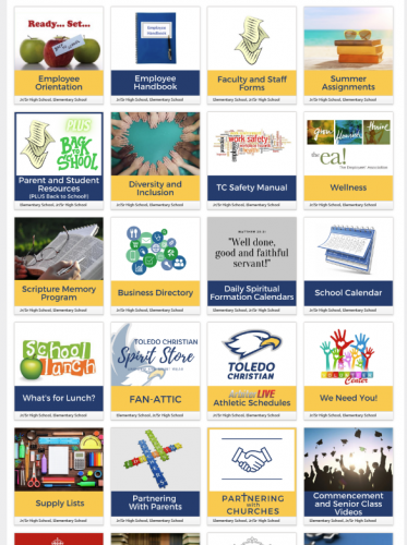
My question for you is, how did you hide the school level labels? I'd love to clean it up more. Since very few, if any, tiles are only for one school level, they're not of much use to us.
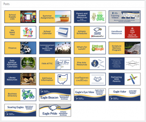
We reorganize the order according to the time of year. Some things are always at the bottom (archive tiles for our newsletters, etc.) and what's at the top depends on what time of year. This is the Faculty board (most, if not all, parent tiles are also available to faculty so this is the most robust board). We are approaching employee orientation week so things they need for that and the employee handbook are at the top. As the year goes on, those will be rearranged lower to make room for things they might use more often during the school year like the lunch menu, scripture memory schedule, sports schedules, etc.
1 -
We did an update a year or so ago and the response to the bold text (with a few photos for interest) tiles has been positive. Our tiles were all very similar and it was difficult to differentiate them at first glance. I started with a general theme of a different color for each division, aqua blue for LS, yellow for MS, navy blue for US, and orange for all school. It varies from that a bit so that the color mix stays somewhat balanced, but when you view each division's board, the differentiation is still fairly apparent. Like others, however, they are not searchable since the name is in the graphic rather than in the title field. This is our faculty board, just one more visual for consideration. ?
 1
1 -
@Toledo Christian Schools In terms of hiding the school level labels, it looks like the screenshot I took was for a parent who only had a child in one division. I guess if you are only a part of one division, the school levels don't show up. But when I impersonate a parent with children in multiple divisions, that is when the school level labels show up. So, unfortunately, I think that's out of our control.
 0
0 -
@Lily Yee We just use the same dimensions for every tile graphic we create. The dimensions of the tiles in my screenshot are all 500px x 175px.
I originally used Photoshop to create the tile graphics, but will likely use Canva when I create the new tiles. I'll set up a project in Canva with whatever dimensions we decide on, and then just duplicate pages and adjust the content for each of the buttons. This way, all of the buttons are in one place.
0 -
Yes, I think you're right. I tried impersonating a variety of parents and it looks like if they have children in multiple levels, the level labels show, but if they only have children in one level, the labels don't show. I guess that makes sense, but it's annoying. LOL
BTW, you inspired us to refresh our RB, so here's our new look!
I used Canva for the original tiles, so I just copied the project, resized the canvas, rearranged the contents, and voila! Really, really easy to do in Canva. My new tiles ended up being 500 x 200. It just translated better that way. Thanks so much for the idea!
 1
1 -
@Ginette Buffone
Hi!
We use the same color for each board which our graphic designer builds in Canva. Early on we had photos but I realized it was too busy.
What I really like about the boards for parents is that it's very clean and easy to navigate. We try to limit the number of boards offered and try not to exceed 18-20 boards. We have a few boards that are seasonal….with a play, back-to-school resources, etc. It also looks good on a phone.
We have four A-Z division boards that are the “nuts & bolts” for what a parent needs to know for each division such as carpool times, uniforms, birthday celebrations, lunch rules, etc, etc.
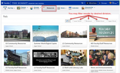
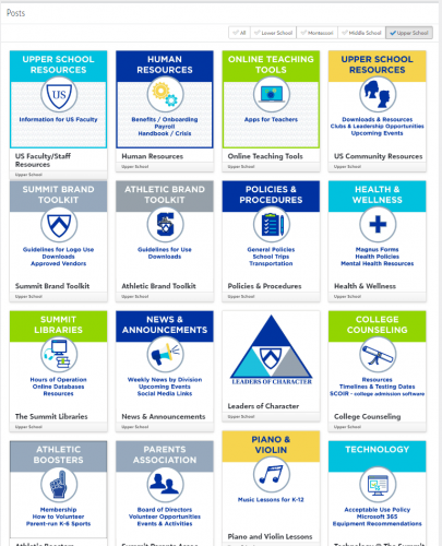
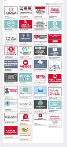
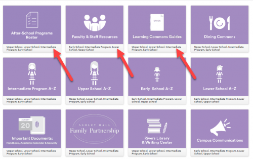
Does anyone know how to hide the divisions from showing on the faculty persona, as seen in my second image below? (the red arrows) I'd love for our internal boards to look as clean as the parent ones!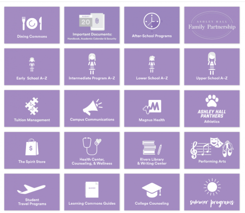
How can we hide the division names from the faculty boards? The image below are the faculty baords.
 1
1 -
@Kim Yager
I noticed your faculty boards don't include the division names. Do you know how those are hidden? My photo below is what I'm talking about. 0
0 -
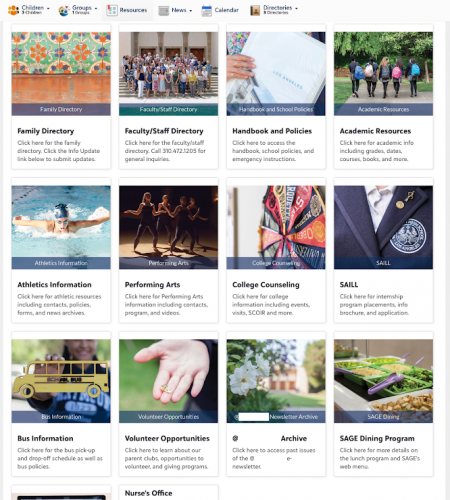
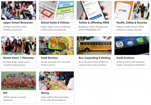
In case this is helpful, below is what we went with, and it has been very well received.
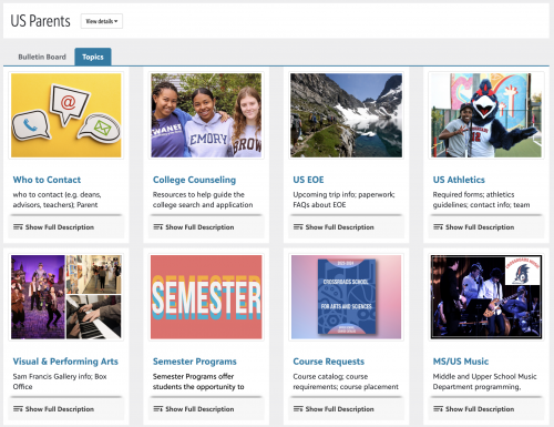
In terms of organization of content, the idea was to have the Resources page be more K-12 resources, and then each division has their own Resource button, which links to the Topics tab of their respective division parent group (we have the following community groups setup - ES Parent, MS Parents, US Parents). The Topics tab is where you find those division specific resources (e.g. after-school care, college counseling). I'm not sure if this all makes sense. We know that Resources can be assigned to certain divisions, but we wanted to keep down the amount of buttons, as it can quickly get overwhelming. I'll also include a screenshot of a division's Topics tab.
In terms of design, we liked the photo idea and utilizing the titles and descriptions, so people could use the Find feature in their browser. We made sure our titles were only one line and the descriptions were only two lines, to keep things in a clean, grid-like order.
NEW RESOURCE BOARD
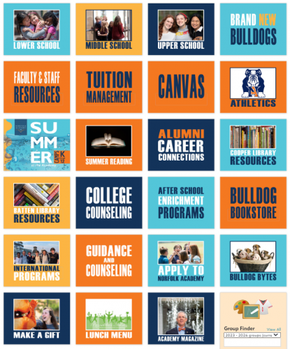
TOPICS PAGE (for Upper School…the Upper School Resources button above links to this Topics page. Some of the Topics on here are also shared/published to the US Student Topics page.)
 1
1


Categories
- All Categories
- 6 Blackbaud Community Help
- 213 bbcon®
- 1.4K Blackbaud Altru®
- 401 Blackbaud Award Management™ and Blackbaud Stewardship Management™
- 1.1K Blackbaud CRM™ and Blackbaud Internet Solutions™
- 15 donorCentrics®
- 360 Blackbaud eTapestry®
- 2.6K Blackbaud Financial Edge NXT®
- 655 Blackbaud Grantmaking™
- 576 Blackbaud Education Management Solutions for Higher Education
- 3.2K Blackbaud Education Management Solutions for K-12 Schools
- 939 Blackbaud Luminate Online® and Blackbaud TeamRaiser®
- 84 JustGiving® from Blackbaud®
- 6.6K Blackbaud Raiser's Edge NXT®
- 3.7K SKY Developer
- 248 ResearchPoint™
- 119 Blackbaud Tuition Management™
- 165 Organizational Best Practices
- 241 Member Lounge (Just for Fun)
- 34 Blackbaud Community Challenges
- 34 PowerUp Challenges
- 3 (Open) PowerUp Challenge: Chat for Blackbaud AI
- 3 (Closed) PowerUp Challenge: Data Health
- 3 (Closed) Raiser's Edge NXT PowerUp Challenge: Product Update Briefing
- 3 (Closed) Raiser's Edge NXT PowerUp Challenge: Standard Reports+
- 3 (Closed) Raiser's Edge NXT PowerUp Challenge: Email Marketing
- 3 (Closed) Raiser's Edge NXT PowerUp Challenge: Gift Management
- 4 (Closed) Raiser's Edge NXT PowerUp Challenge: Event Management
- 3 (Closed) Raiser's Edge NXT PowerUp Challenge: Home Page
- 4 (Closed) Raiser's Edge NXT PowerUp Challenge: Standard Reports
- 4 (Closed) Raiser's Edge NXT PowerUp Challenge: Query
- 792 Community News
- 2.9K Jobs Board
- 53 Blackbaud SKY® Reporting Announcements
- 47 Blackbaud CRM Higher Ed Product Advisory Group (HE PAG)
- 19 Blackbaud CRM Product Advisory Group (BBCRM PAG)