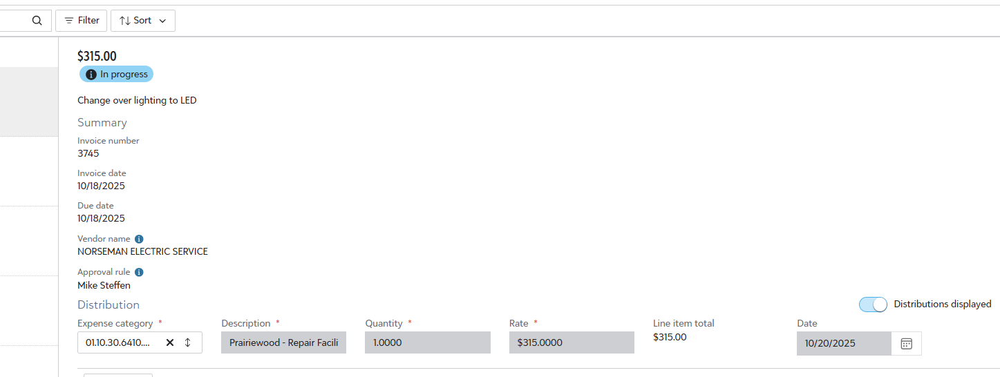
Expense Approval - New View
This new view of approvals is a bit harder to review. There's a lot of wasted white space on the page. Also, I now I have to scroll to get to and open the attachment. Please someone tell me this is a small glitch today.
It used to look like this… We knew right where to look to verify info
Answers
-
I'm seeing the same format, not just in the approval, but if I go to the request I submitted, it has same format.
0 -
And yes, I know scrolling sounds like it's not big deal. But when you do hundreds of approvals per week, every new scroll and click is noticed. It adds time and I am not sure what the benefit would be here, unless it's for mobile view… which I would hope we are not catering to for this process.
1 -
I agree Kristy. This single column of header information is not efficient.
0
Categories
- All Categories
- Blackbaud Agents for Good™
- Raiser's Edge NXT test
- 6 Blackbaud Community Help
- 211 bbcon®
- 1.4K Blackbaud Altru®
- 403 Blackbaud Award Management™ and Blackbaud Stewardship Management™
- 1.2K Blackbaud CRM™ and Blackbaud Internet Solutions™
- 16 donorCentrics®
- 360 Blackbaud eTapestry®
- 2.6K Blackbaud Financial Edge NXT®
- 661 Blackbaud Grantmaking™
- 583 Blackbaud Education Management Solutions for Higher Education
- 3.3K Blackbaud Education Management Solutions for K-12 Schools
- 947 Blackbaud Luminate Online® and Blackbaud TeamRaiser®
- 84 JustGiving® from Blackbaud®
- 6.8K Blackbaud Raiser's Edge NXT®
- 3.8K SKY Developer
- 251 ResearchPoint™
- 120 Blackbaud Tuition Management™
- 165 Organizational Best Practices
- 243 Member Lounge (Just for Fun)
- 37 Blackbaud Community Challenges
- 37 PowerUp Challenges
- 3 (Closed) PowerUp Challenge: Grid View Batch
- 3 (Closed) PowerUp Challenge: Chat for Blackbaud AI
- 3 (Closed) PowerUp Challenge: Data Health
- 3 (Closed) Raiser's Edge NXT PowerUp Challenge: Product Update Briefing
- 3 (Closed) Raiser's Edge NXT PowerUp Challenge: Standard Reports+
- 3 (Closed) Raiser's Edge NXT PowerUp Challenge: Email Marketing
- 3 (Closed) Raiser's Edge NXT PowerUp Challenge: Gift Management
- 4 (Closed) Raiser's Edge NXT PowerUp Challenge: Event Management
- 3 (Closed) Raiser's Edge NXT PowerUp Challenge: Home Page
- 4 (Closed) Raiser's Edge NXT PowerUp Challenge: Standard Reports
- 4 (Closed) Raiser's Edge NXT PowerUp Challenge: Query
- 804 Community News
- 3K Jobs Board
- 57 Blackbaud SKY® Reporting Announcements
- 47 Blackbaud CRM Higher Ed Product Advisory Group (HE PAG)
- 19 Blackbaud CRM Product Advisory Group (BBCRM PAG)


