How can you fill window with Page Add-in


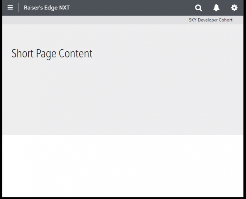
With a page add-in that does not have enough content to fill the vertical space in the browser window, there is a space below the iframe that does not match the background of the add-in, if there is any, like:
Is there any way to
(1) format the area outside the iframe,
(2) request the iframe have a minimum height of the host window,
or (3) request the height from the host to resize the document in the iframe from script inside the iframe
?
TIA
Comments
-
Hi Scott,
Good question and thanks for reaching out!
Let me investigate this and I'll report back - in the meantime, is it possible to set your backcolor to white so it's indistinguishable from the host page?
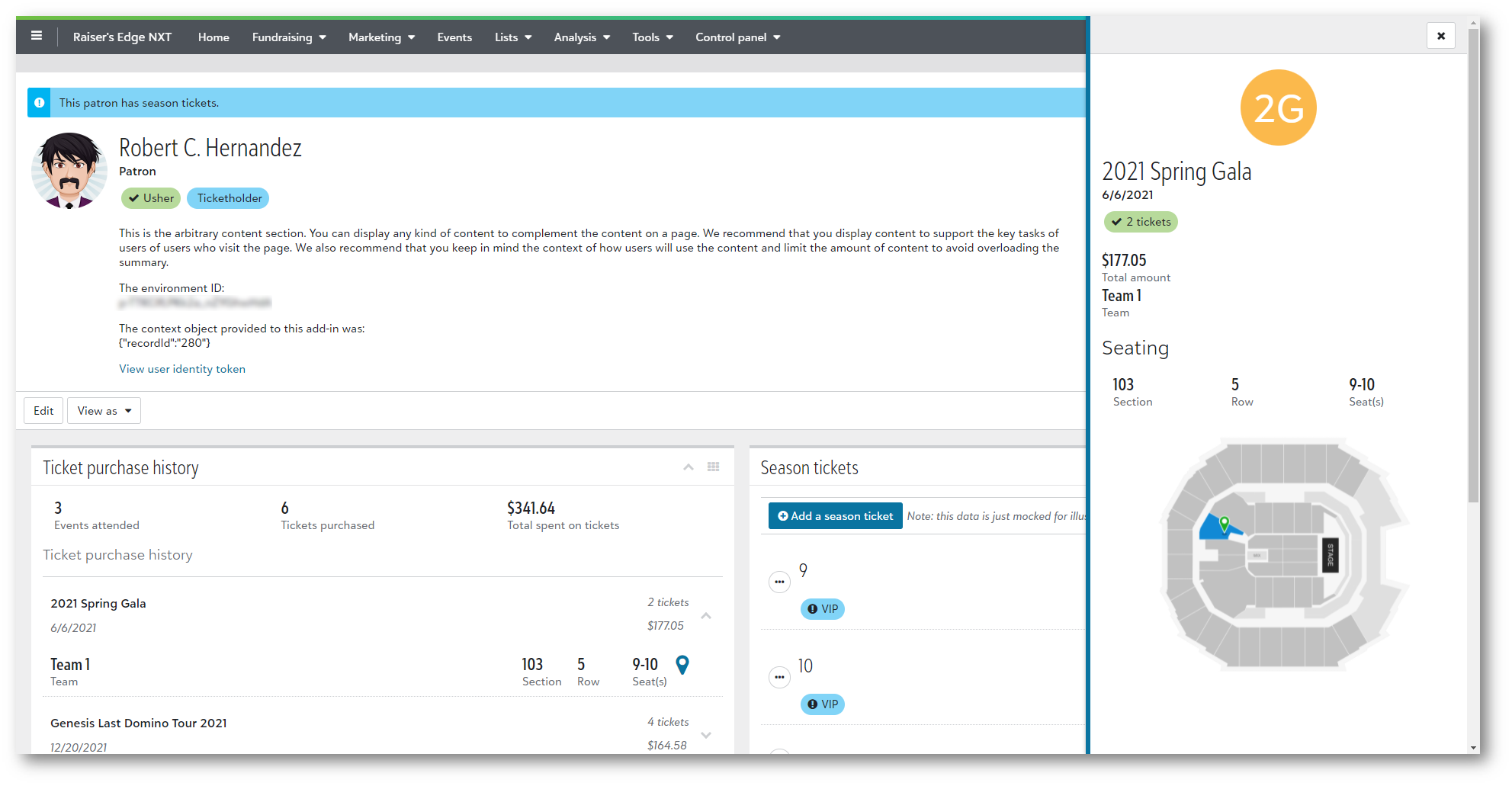
As an example - while building the full-page add-in feature we created a few demo pages (with fake/sample data) just to show the art of the possible. Here's a custom “Patron page” one might envision accessing from the RENXT Constituent page via the “Add-ins” button in the toolbar:
Here's another example (with less content) showing a “Sponsor page":
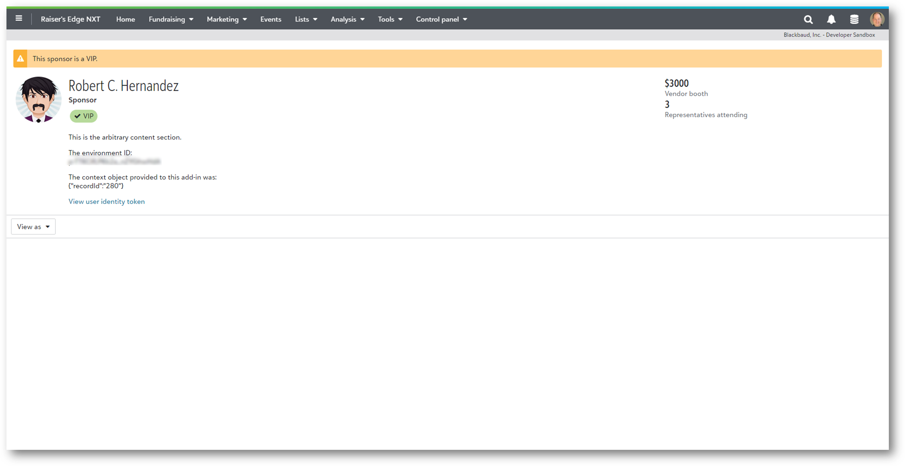
Both pages have a white background so it blends well with the host page.
Let me know if setting the backcolor is an option for you.
0 -
Thanks for your quick reply, Ben. We could set the background to white if necessary, but if you want to try to provide a streamlined experience with the tiled UX elsewhere, the white background is pretty limiting. Your first example, the "Patron page" would demonstrate this same issue if you reduced height of the page enough that the aggregate height of the header plus the tiles to be less than the height of the browser window. In this case, you would have the white space below the bottom most tile like my (not nearly as cool) sample.
Setting the background to white along with some style changes to the borders on the tiles could be passable, but to the user it would be a bit jarring from the experience in other similar view layouts.
Thanks again for the quick response.
0


Categories
- All Categories
- New YourCause Community TEST
- New SKY Community TEST
- New Grantmaking TEST Community
- New Altru Test Community
- New bbcon Community - TEST
- 12 Blackbaud Agents for Good™
- New Raiser's Edge NXT Community
- 7 Blackbaud Community Help
- 218 bbcon®
- 1.4K Blackbaud Altru®
- 409 Blackbaud Award Management™ and Blackbaud Stewardship Management™
- 1.2K Blackbaud CRM™ and Blackbaud Internet Solutions™
- 16 donorCentrics®
- 361 Blackbaud eTapestry®
- 2.7K Blackbaud Financial Edge NXT®
- 680 Blackbaud Grantmaking™
- 598 Blackbaud Education Management Solutions for Higher Education
- 3.3K Blackbaud Education Management Solutions for K-12 Schools
- 952 Blackbaud Luminate Online® and Blackbaud TeamRaiser®
- 85 JustGiving® from Blackbaud®
- 7K Blackbaud Raiser's Edge NXT®
- 3.9K SKY Developer
- 257 ResearchPoint™
- 123 Blackbaud Tuition Management™
- 165 Organizational Best Practices
- 247 Member Lounge (Just for Fun)
- 40 Blackbaud Community Challenges
- 37 PowerUp Challenges
- 3 (Closed) PowerUp Challenge: Grid View Batch
- 3 (Closed) PowerUp Challenge: Chat for Blackbaud AI
- 3 (Closed) PowerUp Challenge: Data Health
- 3 (Closed) Raiser's Edge NXT PowerUp Challenge: Product Update Briefing
- 3 (Closed) Raiser's Edge NXT PowerUp Challenge: Standard Reports+
- 3 (Closed) Raiser's Edge NXT PowerUp Challenge: Email Marketing
- 3 (Closed) Raiser's Edge NXT PowerUp Challenge: Gift Management
- 4 (Closed) Raiser's Edge NXT PowerUp Challenge: Event Management
- 3 (Closed) Raiser's Edge NXT PowerUp Challenge: Home Page
- 4 (Closed) Raiser's Edge NXT PowerUp Challenge: Standard Reports
- 4 (Closed) Raiser's Edge NXT PowerUp Challenge: Query
- 822 Community News
- 3.1K Jobs Board
- 57 Blackbaud SKY® Reporting Announcements
- 47 Blackbaud CRM Higher Ed Product Advisory Group (HE PAG)
- 19 Blackbaud CRM Product Advisory Group (BBCRM PAG)